
Design System Maturity Scale

As a cocky young web designer I used to append brand guidelines with digital guidance. I tsk’ed as I added hex codes to colour guides, and took great pleasure in telling graphic designers that their font choice wouldn’t work on the web. Oh what a joy I must have been to work with…
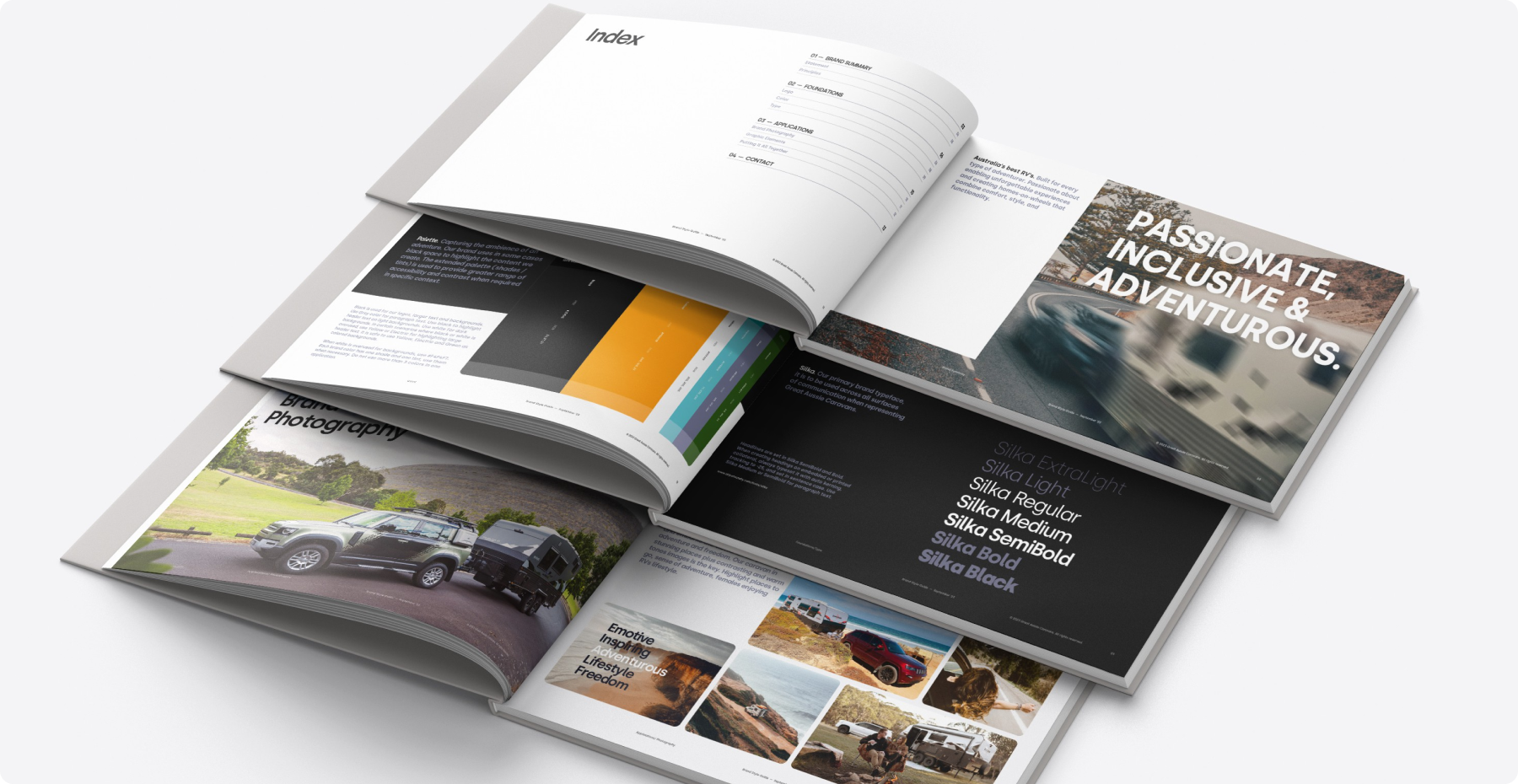
Back in those days, that was the system. Usually a large A3 binder and equivelent PDF. This was the canon upon which all further creative artefacts were to be created. Change was rare and expensive; the flexibility of these ‘systems’ were often rigid and inhibiting of further creative collateral. It was sexy for sure, but not scaleable.
branding guidelines by John Baiatul
Jump to 20 years later and we build design systems like products alongside our products. They’re as technical as they are creative, and they are the ultimate design challenge.
As someone who lives inside a design system day-to-day that serves a large product portfolio, its easy to be a snob about what constitutes a design system. It’s also easy to forget how much more complex they can be. I had my eyes well and truly opened by Ford Motor Company’s talk at Figma’s Config conference where they unpacked the multi-brand, multi-car, multi-theme system they are managing. Hat’s off to those guys.
I’ve deliberately decoupled practical resources with the human resourcing side of design systems for the purposes of clarity. Perhaps this is a whole separate article.Design Systems by maturity
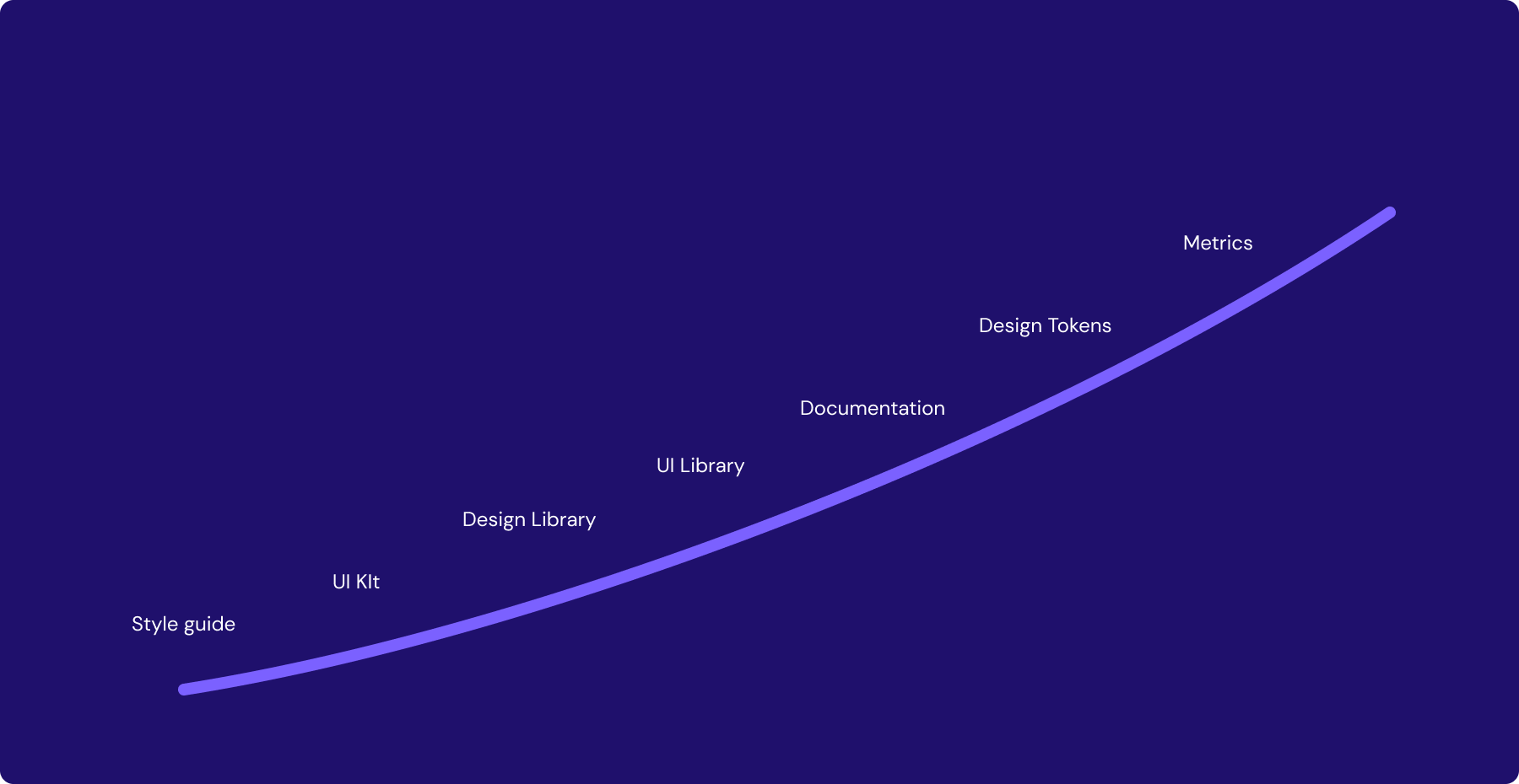
1.Style guide
A style guide is generally one or a few pages that provide direction on the colors, fonts and acceptable artefacts that have been established within a brand. Useful for socialising the design language for a brand.
2.UI Kit
A UI kit provides more functionality than a style guide. UI Kits take advantage of the reusable assets and styling features built into tools like Figma, Sketch and XD. This makes it possible to create digital experiences from a prefabricated library of UI elements that have been styled to align with the brand style guide.
3. Design Library
A little more nuance, a design library (DL) is the first sign of a true ‘system’ in play. A DL is a directory of contributing assets, styles and variables, distributed into multiple (preferably versioned) libraries. They are then combined into a reference file that is always offering the most up-to-date design assets and styles.
At this point I want to introduce the operational dependency that comes with scaling a design system. Style guides and UI kits can be created and managed by a team of one. But beginning the journey of offering a design system to a cohort of consumer requires operational investment, i.e. people. Responsibility rapidly escalates as the design system becomes the source of truth for colors, fonts, inputs, alerts, charts, labels and wording, brand alignment, illustration style, icon constraints - the list goes on.
Providing a design system becomes a service that requires investment in order to meet the demand.
4. (DL)+UI Library
You may have heard of services like Tailwind, Ant Design, Bootstrap and MUI. These services are unbranded (and sometimes completely unstyled) libraries of UI component or widgets deployable as production ready code. You may hear the term headless, which essentially means the components are unstyled, just structured code ready to be dressed up however you wish.
Now that we’re talking about code, this really is the next level up from simply offering ‘design’ services. As a design system provider you are now taking responsibility for the design and translation of that design into code. Including all of the properties that come with your components. Offering a UI library creates another level of control over how your product experience is deployed by engineers.
In relation to operations, you may now be considering adding a front-end developer / UI engineer to your design system team to help create, manage and maintain the code.
5. (DL+UI)+Docs
You need commentary, you need examples, you need context. Enter design system documentation libraries.
Relatively new in the world of design systems are DS-specific documentation services such as Zeroheight and Supernova. Traditionally, organisations would have relied on their incumbent documentation services such as Google Docs or Atlassian Confluence to keep notes on how to use artefacts and materials within a design system. But these new tools are offering far more integrations with industry tools like Figma and Storybook to bring together the design, code, writing, research and more, into one place.
6. (DL+UI+Docs)+Design Tokens
The system is really getting complex now. You’ve got your designs in one tool and a UI component library in another, and documentation explaining how it all works. Designers can prototype new features with the design components, safe in the knowledge that they match the UI components that the engineers are deploying to code. Right?
Inconsistency between design, code and docs assets is a major point of pain for design system teams because none of them share a common language. Enter design tokens.
Design tokens are a simple set of instructions for UI design, written in a simple markup language that makes them readable by any application. This means that not only can they be informing your design library, your UI library and you documentation, but they can be powering your product or portfolio of products also.
Design tokens are the blueprint for your UI design. They contain the values for all colors, spacing, typography, borders and effects. Change it once and it changes everywhere. This is the single source of truth in its truest sense.
7. (DL+UI+Docs+Tokens)+Metrics
It’s rare that you would think metrics any sooner than reaching a fairly reasonable maturity with your design system. If you did, kudos. But it’s at this point in your journey that you start to wonder how many people are using my design system? How many are not? How many products are using old code, or out of date tokens? Is my design system delivering value?!?
Don’t sleep on metrics. Sooner or later someone will want numbers, and you have to be armed and ready. You may consider your own solution here, but there are now great tools on the market specifically for this use. Componly claims to be the design system OS, but what I really like about it is it’s ability to draw information from your repos and show DS adoption. Luro is another early phase tool. And Omlet is also another promising tool.
Consumption multiplier
The design system maturity examples we’ve looked at so far demonstrate multiple resource densities that a DS can contain. But what about the products they serve? The number of products and number of brands that consume your design system ultimately multiplies the complexity and perceived maturity of your design system. Let’s face it. offering a level 7 design system across a multi-product, multi-brand portfolio is probably as mature as it gets.
Maturity Score?
It begs the question, would there be value in developing a mechanism for a maturity score? It could be a fun experiement but also a little self serving. After-all, who is keeping score?
What do you think? Does it get more mature? Do you see a place for a maturity score?