
Design system metrics, the boss play

I’ve already written articles about the cost of design systems to get you thinking about the investment that is required to really run a design system. If you’re climbing up the design system maturity scale in your organisation, then you are probably spending as much time seeking funding for your DS as you are actually building it - and that’s exactly when you realise you need metrics.
The best way to think about metrics for your design system is to first ask what you need to know. What is important to you and your organisation? What will indicate progress and what will flag concern? As ever, it depends on who you are but let’s imagine you are indeed looking for more investment in your design system operations, what metrics are going to support your case?
We can all rhyme off the reasons for building and maintaining a design system in any customer facing organisation. But as a top 3 I’d say…
Consistency
Speed
Quality
No doubt this is something along the lines of the promise you made to your exec in the first place, so it’s a great place to start. Let’s show them that we thought about measuring our success, making real customer impact and are accountable to our promises.
Consistency
Design systems make the promise of delivering consistent experiences through the deployment of reusable styles, components, patterns and assets. If these resources aren’t being used, used incorrectly, or worse, being deliberately bastardised, then inconsistency creeps in. So how might we ensure that our components are being deployed appropriately and with full coverage across products, apps and marketing.
There are a few tools that are making strides into design system monitoring, but one that is leading in the market is Componly.io. This tool requires read-access to your product repo before doing a full audit of your system and presenting you with some hard truths in a dashboard.
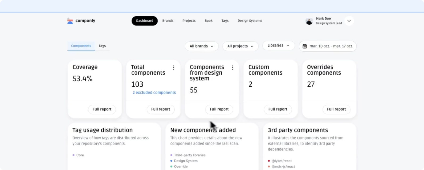
Componly’s dashboard displays ‘Coverage’ as a main factor of consistency
Componly does a lot, but it’s strength as a tool is that it gives you a “coverage score”. This means out of all the components being consumed, you can see how many are from your design system as a percentage. Take this one step further and you can track it over time, set objectives for your team and regularly report on the impact of your efforts.
Componly is the only tool I’ve seen offering this coverage score, and is without doubt an essential tool for anyone running complex product suits and portfolios, seeking to create consistent experiences for their customers.
Speed
If there’s one thing execs want is fast delivery. Products and features shipped and sold. Design systems are supposed to grease the wheels of delivery, not add friction (as some engineers might testify). So how might we measure our design systems’ efficacy as a delivery accelerator?
The go-to solution here is to configure your project management tool to perform some reporting on throughput with and without a design system. But this is muddy territory. Velocity as it’s commonly known is dependent upon many things such as ticket size, ticket type, dependencies and good AC’s and requirements. Extrapolating a score that shows the design system is having an impact, especially on external engineering or design teams is extremely hard.
My recommendation here is to seek quantitive data. Ask your community for how they feel the design system helps them. Gain sentiment scores and take some averages. Do this regularly using survey tools such as Google Forms or Typeform and track it over time for scores that will keep you on track and honest.
Quality
Beauty is in the eye of beholder, and in your case, the beholder is the person using your product. The ultimate judge of your success is the person choosing to pour revenue into your organisation and don’t forget that. So when we think about quality, it’s the perceived quality of your product or website by your user or customer that matters.
For this, there is the net promoter score (NPS). A universally recognised score that assesses how likely a consumer is to recommend your product to someone else. Now, there is a lot of factors that go into measuring NPS, nono of which are anything to do with whether a design system is powering the user experience!
Designing a good user experience for a product is no cake walk, but delivering consistent, high quality experiences across multiple media and products is a huge undertaking. And when customers are engaging with your brand through these multiple interfaces, they will decide on your fate on any one of these moments letting them down. NPS is a great way to see the full picture of your customers’ brand experience.
So, how do you measure yours? Let me know on X @theresmike