
Platformification with a Design System
The culmination of 4 years work leading the design and integration of a design system at a world-leading Cybersecurity company to deliver a cohesive platform experience.
The Challenge
When I joined Rapid7 in 2021 their offering had experienced incredible growth, both from their own homegrown products, but also through acquisition of multiple security products to allow them to offer the full gamut of vulnerability, cloud and detection products to customers. This growth came with debt, integrating different tools into a cohesive platform was a ambitious challenge.
My role
Lead to Principal visual designer (IC+Manager hybrid) responsible for the vision, design and usability of the design system.
Lasting impact
Enabled 1,500+ product delivery capability with design system artifacts, increasing velocity 8x. Evolved and modernised visual design UI.
Delivered
Figma design library
4x Themes powered by Design Tokens
Atomic library architecture, atoms through to experiences
Accessible Color System inc. Data Visualization guidance
Global Filtering Experience
Illustration library
Icon library
Design System Documentation Website
Integration with MUI front-end workflow
All artifacts delivered as part of a design system team, only listed deliverables in which I led or heavily contributed.
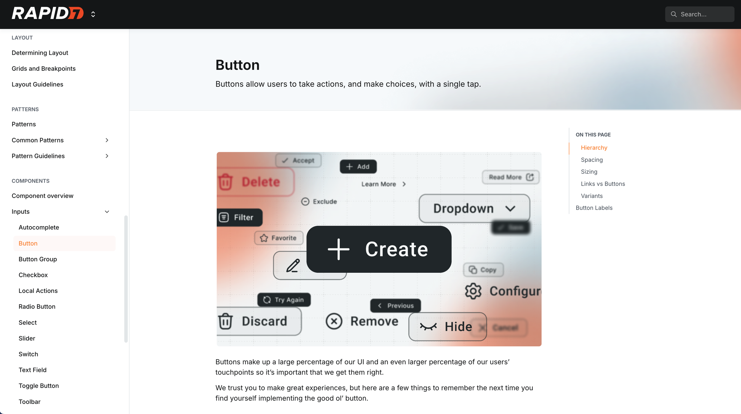
Figma Design Library
Atoms
The design system started by crafting a library of base components that pain-stakingly reflected the properties and composition of the front-end library the team had identified that would accelerate delivery - MUI.
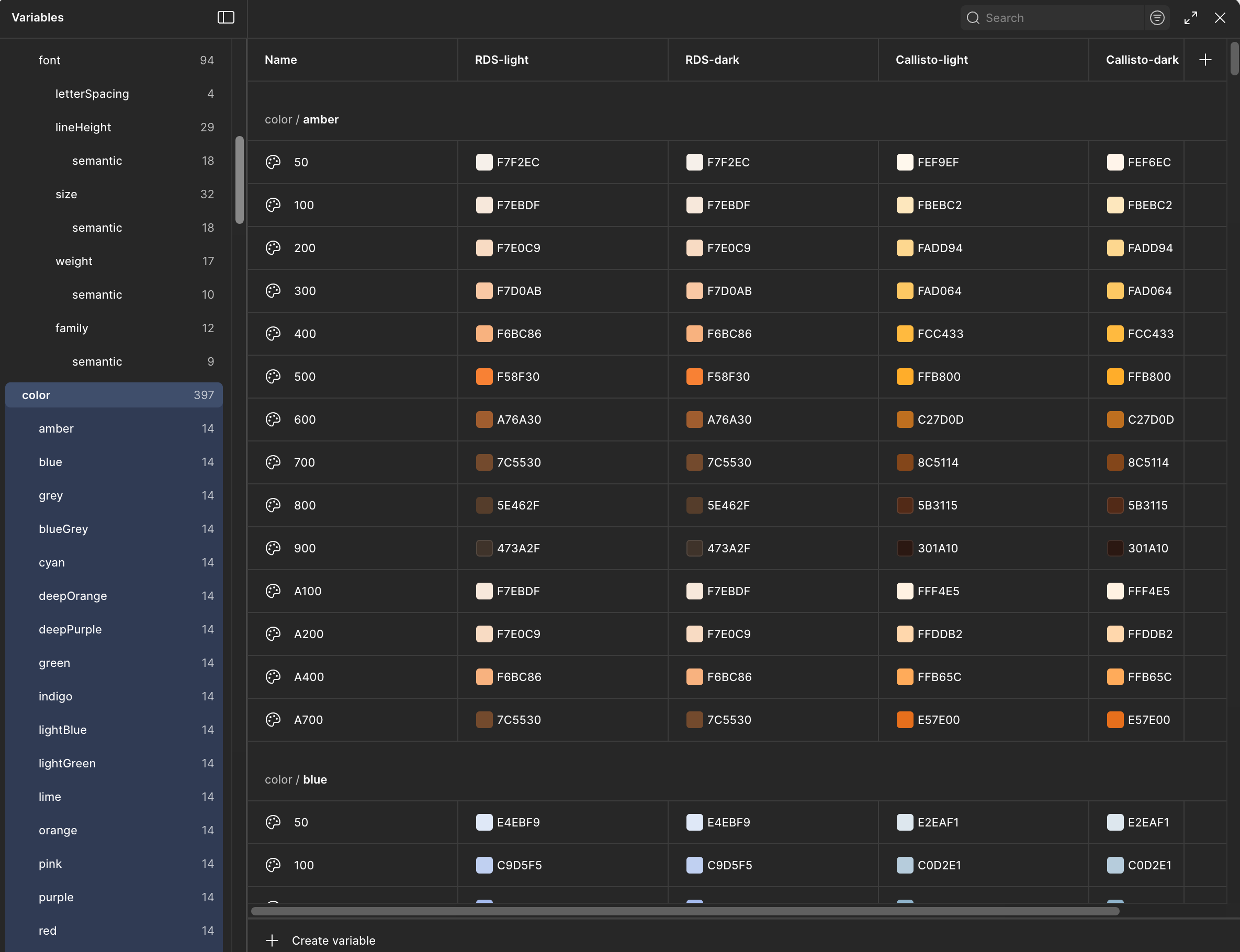
After many false starts and a lot of head scratching, we created our schema for design tokens. Initially we use Token Studio Pro to pure play design tokens into our design system, but eventually ported across to Figma’s integrated variables when they released the feature.
Design Tokens / Variables
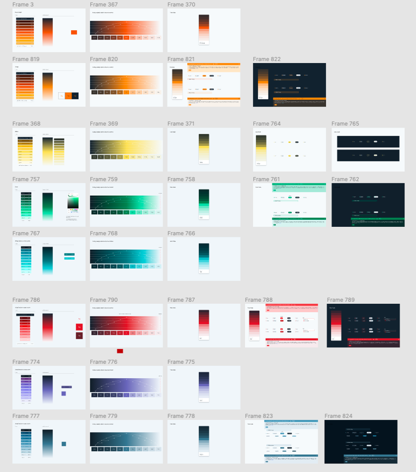
Color System
I conducted a complete review of the color system embedded in the design system. Every color assessed for it’s suitability, accessibility, flexibility across themes and brand compliment. Tweaking hue, saturation and lightness to get the balance just right.
Color matters. It’s more than compliance. It's the first impression. A key part of the trifecta that makes up the soul of the system. Colour, type and space.
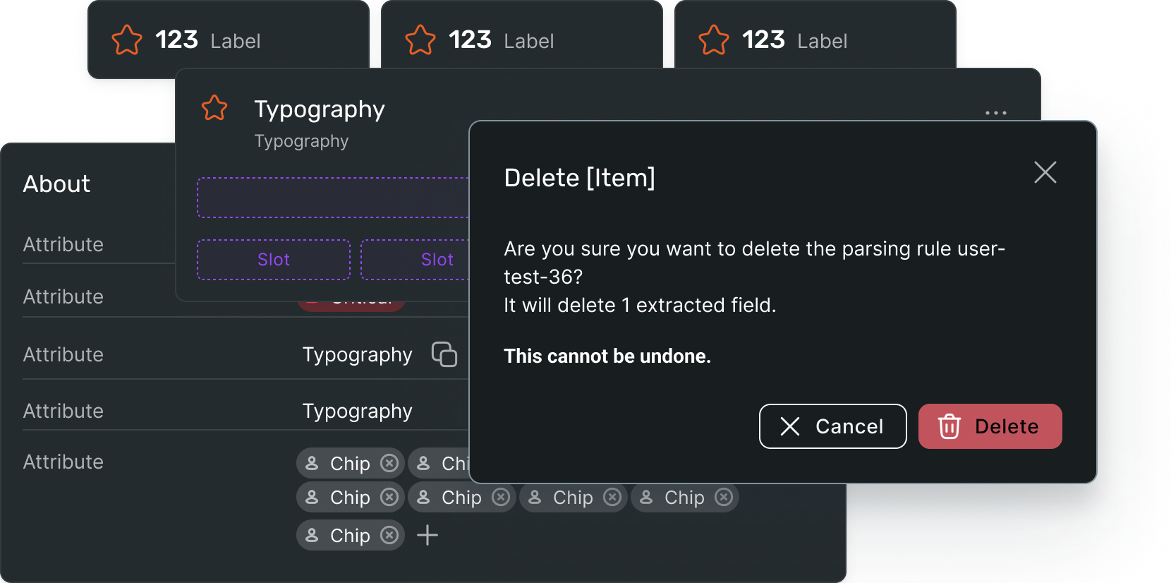
Patterns
Patterns are our much more opinionated components of components, built to enable designers and engineers to create more complex experiences using consistent design decisions.
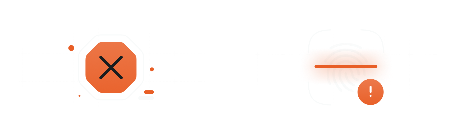
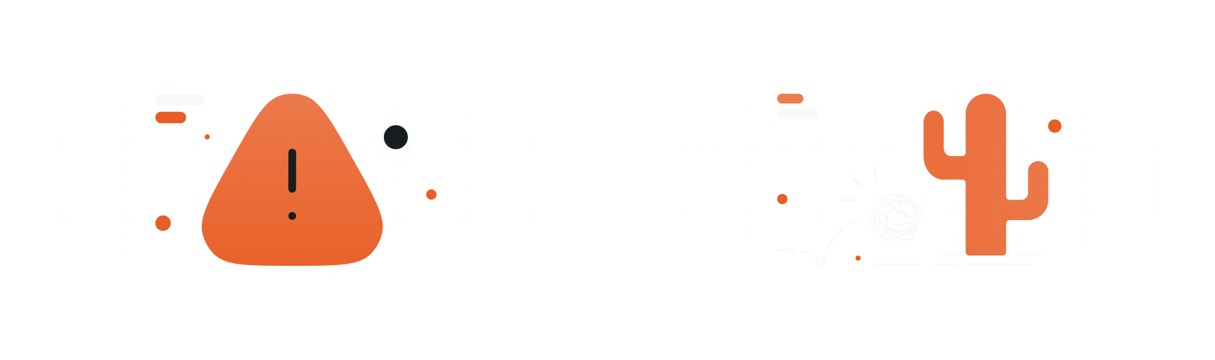
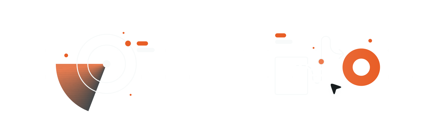
Illustrations
I had a lot of fun establishing a new illustrative style to support our system messaging. I worked with brand and marketing to blend some of our GTM styling with our product experience. The outcome is a library of illustrations that can be dropped into any experience to breathe life into the experience.
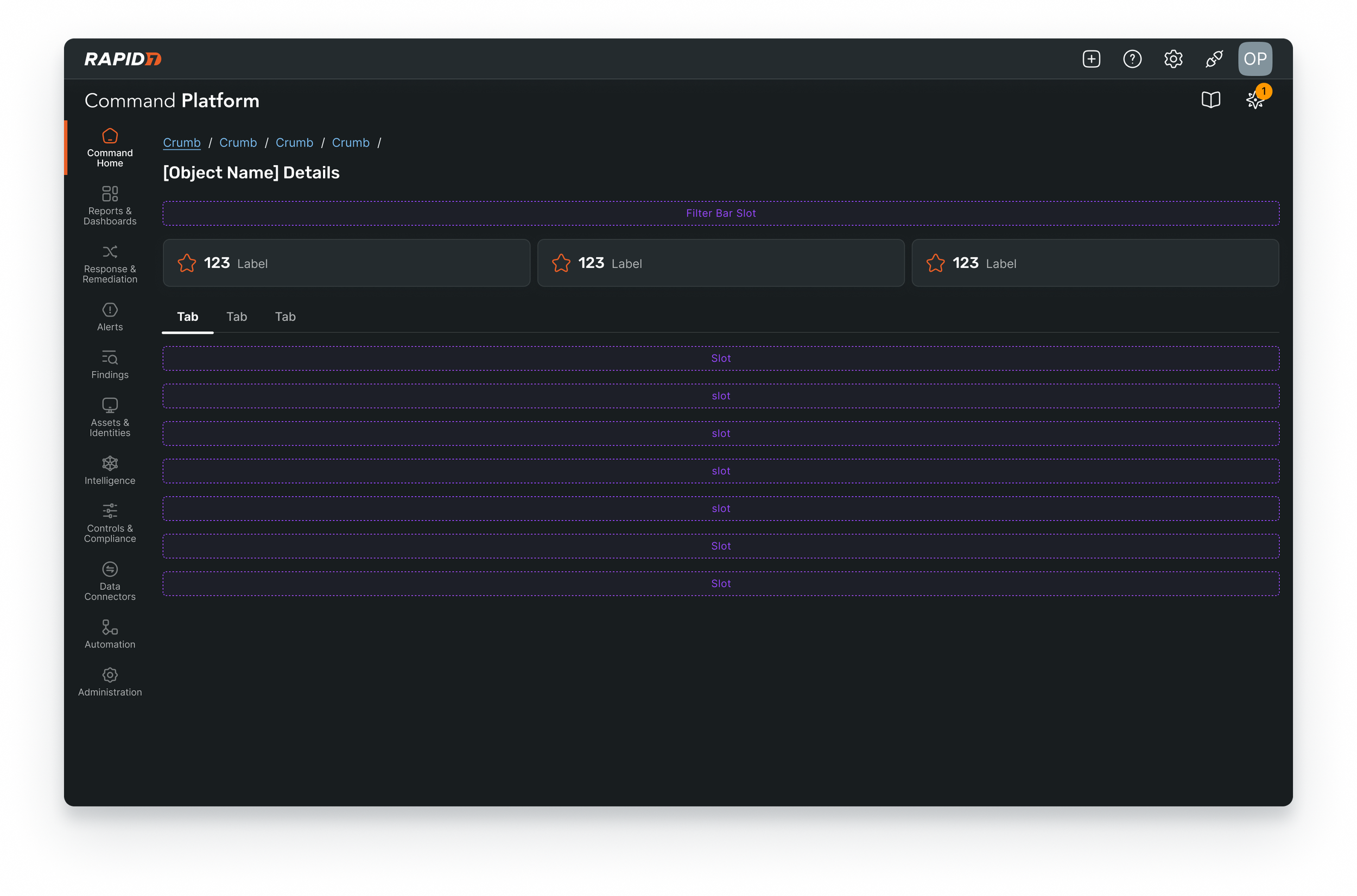
Templates
Templates are page level layouts that include navigation elements and layout scaffolding for the injection of components. The Figma templates include ‘slots’ for picking from predefined patterns and components making design exploration and prototyping extremely fast.
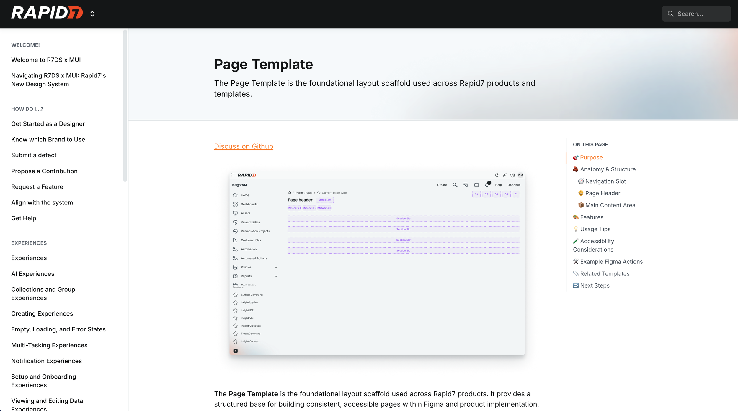
Design System Documentation
We support all our components, patterns, template and experiences with detailed design system documentation. For this solution we chose to partner with Supernova.io which allowed us to integrate Figma directly into the docs, including design tokens and svgs for icons.
1,500+
product personnel across 6 delivery centers ‘enabled’ to create cohesive experiences
77,000+
Component inserts in Figma in first year after release
420+
Component published across 5 libraries
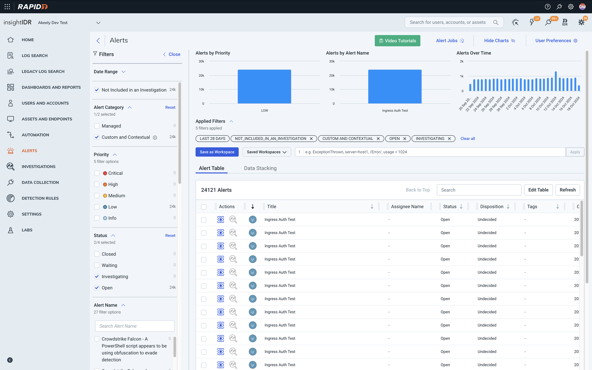
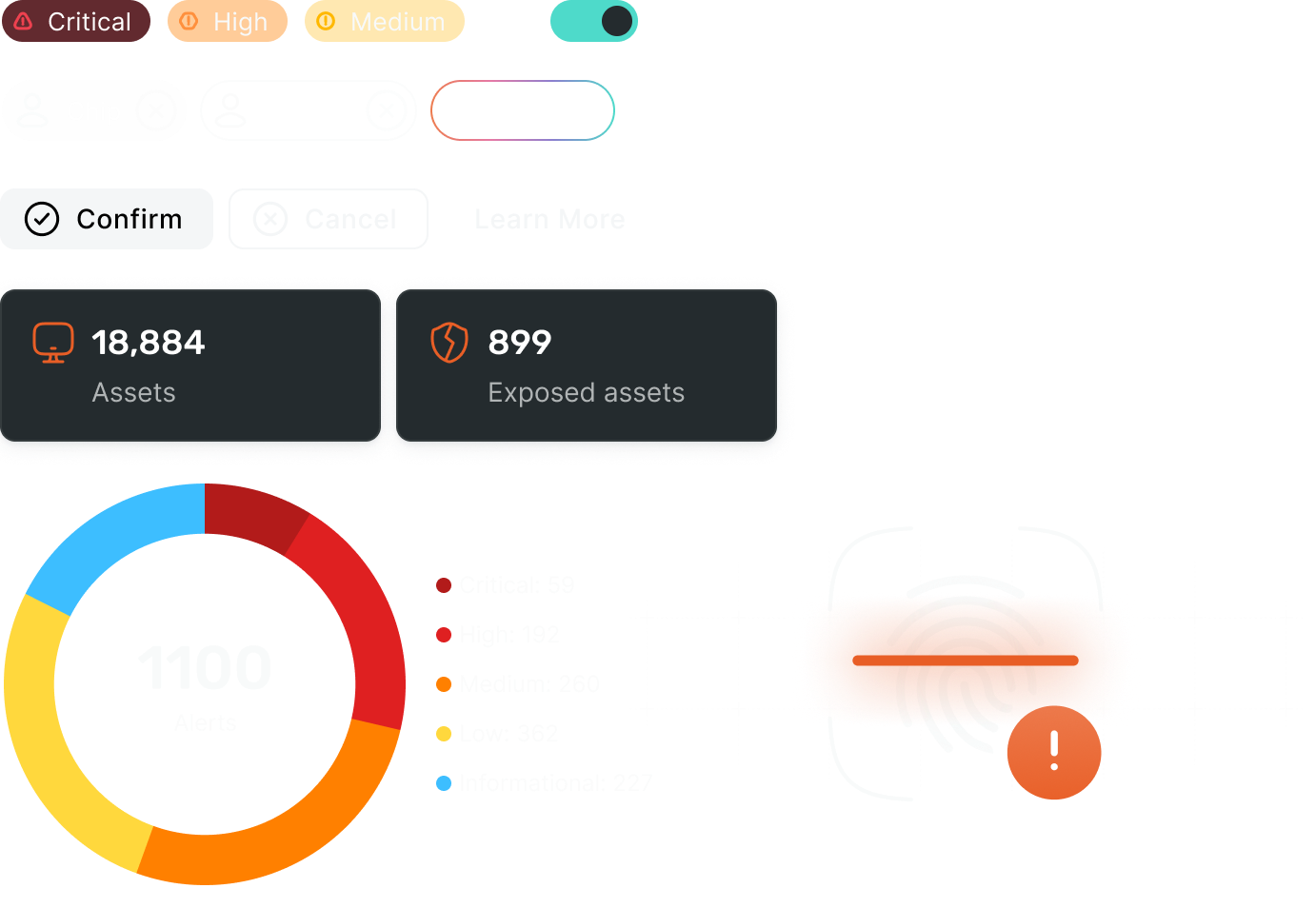
InsightIDR in 2021
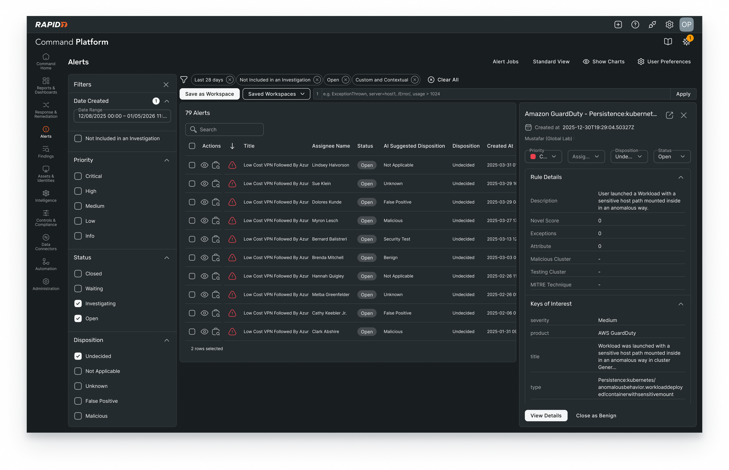
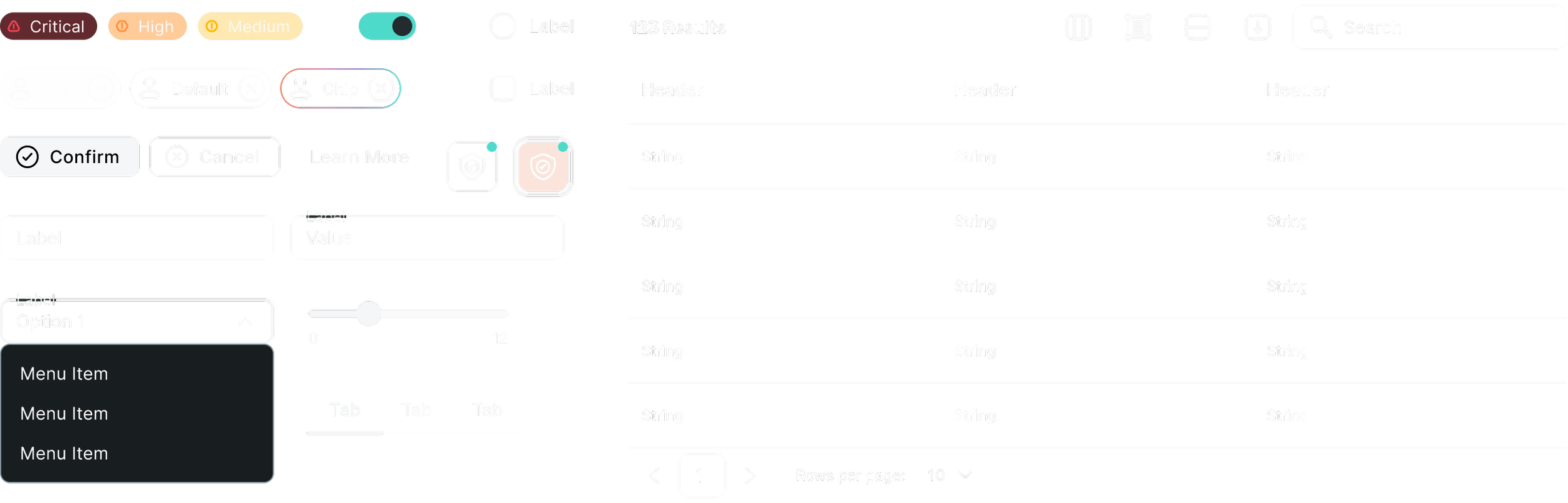
The new Command Platform Alerts Experience in 2025
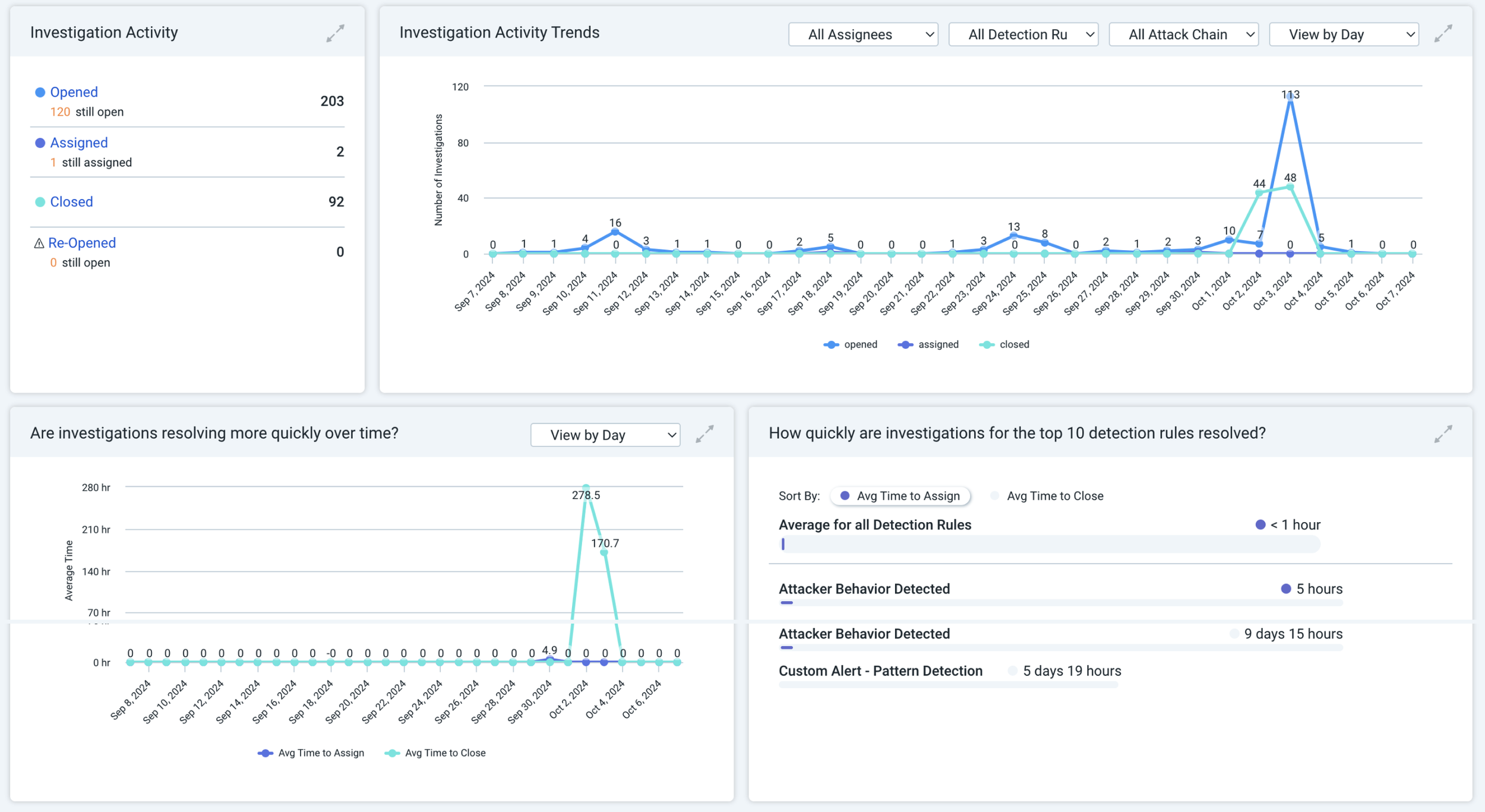
Example of data visualisations in 2021
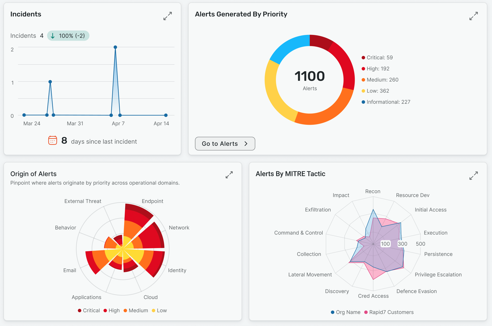
Callisto data visualisations in 2025
It takes a village...
Have no doubt, this work reflects the efforts of a small cross-functional team. My involvement ran deep - leading the work creatively and strategically, while also contributing hands-on as an individual contributor to help the team deliver at a very high bar.